

First Response Pregnangy Test:
Instruction Redesign
———————————— HYPOTHESIS
taking a pregnancy test is nerve wracking as is….
Many women experience anxiety when taking a pregnancy test. Furthermore, the multitude of pregnancy tests on the market can be anxiety-inducing as is. Even after determining the correct test, individuals may be faced with information overload when walking through the instruction sheets.
I hypothesize that simplifying the information presented on these instruction sheets will alleviate anxiety and prevent information overload for the user, making their experience quick and easy.
ROLE
Project Lead
TEAM
Katie Bush
DURATION
February, 2024
3 weeks
———————————— BACKGROUND RESEARCH
Many women experience anxiety when faced with “pregnancy scares.” Furthermore, the multitude of pregnancy tests on the market makes it difficult to determine the right test for a given scenario. Even after determining the correct test, individuals may be faced with information overload when walking through the instruction sheets.
There is an opportunity to alleviate anxiety, embarrassment, or other negative emotions through design intervention.

Observations: Existing instructions and contents
No consistency between instructions
Different fonts
Different layout
Instructions do not include step #
Box is in some ways more informational than instructions
Box photo- all 3 tests look the same
Color co-ordination is inadequate
Only foil wrap is color coded
Early Result/ Rapid Result tests look identical
Information Overload

task Flow: Triple Check Pregnancy Test

User Journey Map
Observational studies were carried out on three (3) participants, and their actions and emotions were recorded through a “think aloud” technique. These actions were analyzed and highlighted areas of opportunity for the user experience .

Exploration
Current pregnancy tests available on the market come in various forms, each equipped with distinct features to cater to diverse preferences and needs.
Different solution requirements of the problem space were kept in mind as constraints for the test stick, including:
Easy to read
Differentiateable
Ease of use
Sanitary

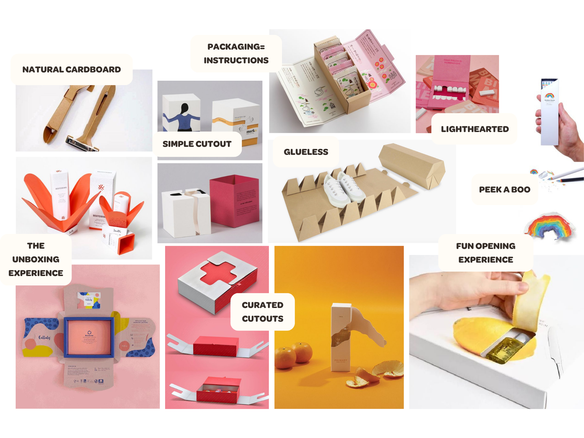
Various packaging methods were explored, as the current First Response Triple Check Pregnancy Test heavily utilizes its packaging to display additional information.
Different solution requirements of the problem space were kept in mind as constraints for packaging, including:
Encouraging
Simple
Clean
Discrete
Different instruction methods were explored, as a major pain point in the user experience of the current First Response Triple Check Pregnancy Test is surrounding
Different solution requirements of the problem space were kept in mind as constraints for instructions, including:
Encouraging
Simple
Consistent
Intuitive
Organized

Ideation and Iteration
Different packaging methods, instruction layouts, and test stick forms were explored, based off of insights from previous secondary research on existing products on the market.

Pamphlet Redesign

A final set of instructions was informed by the insights drawn from thorough secondary research findings and detailed observational studies.
The refined instructions are enhanced with supplementary visuals and hierarchal key words, ensuring that the information is not only easily glanceable but also highly digestible for the audience.


Solution requirements:
Organized
Important info is glanceable
Only include necessary info on the front
Add “step #_” to each step
Simplify information
Combine into one final pamphlet
Improve color co-ordination
Remove redundant info
Emphasize why/when to take test
The finalized pamphlet is fully color-coordinated to the correct test sticks to allow for easy identification. The front of the pamphlet houses important primary information, such as the test type, when to use, and how to use. Additional information is included on the back side of the pamphlet, including important tips and FAQ’s.


Test Stick Redesign
Market research and in-person observations conducted prove that there is opportunity for design to intervene and improve the user journey for the First Response Triple Check Pregnancy Test.
The finalized concept includes color coded caps and thumb grips, allowing for easy identification once unwrapped. The curved design allows the sticks to be rested on a flat countertop, lifting the used end above any surface to ensure a sanitary collection.
Some pain points with the existing test sticks included:
Awkward angle when using stick
No differentiation between sticks once unwrapped
Requires clean-up of testing surface


Future development
Additional Opportunity: Explore the user experience of purchasing these kits and create an informative packaging that ensures a discreet, and “non-embarrassing” checkout process.

